Elements and Principles of Design


Elements and Principles of Design
[quads id=11]
Elements and Principles of Design are essential concepts for artists, designers, and creatives to understand and apply in their work. These foundational principles help guide the creation of visually appealing and effective compositions across various mediums such as graphic design, interior design, architecture, and more.
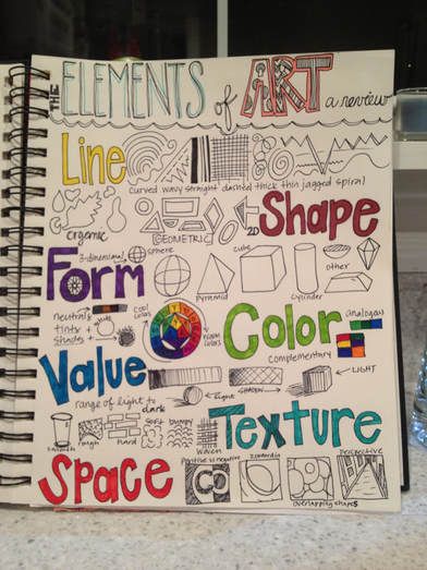
First, let’s break down the Elements of Design. These are the basic components that form the building blocks of any visual composition. The six main elements are:
1. Line: Lines can be straight, curved, thick, thin, or anywhere in between. They can create movement, define shapes, and lead the viewer’s eye through a composition.
2. Shape: Shapes are two-dimensional forms that can be geometric or organic. They can create structure and balance within a design.
3. Color: Color adds interest and emotion to a design. It can evoke different moods and convey meaning. Understanding color theory and how colors interact with each other is crucial in design.
4. Texture: Texture refers to the surface quality of an object or design element. It can be visual or tactile and can add depth and richness to a composition.
5. Value: Value refers to the lightness or darkness of a color. It helps create contrast, depth, and volume within a composition.
6. Space: Space refers to the area in and around objects within a composition. It can be positive (filled with objects) or negative (empty space). Understanding how to manipulate space can create balance, harmony, and emphasis in a design.
Now, let’s move on to the Principles of Design. These are guidelines that help artists and designers organize the Elements of Design to create visually pleasing and cohesive compositions. The main Principles of Design are:
1. Balance: Balance is the distribution of visual weight in a composition. There are three types of balance: symmetrical (equal on both sides), asymmetrical (unequal but still balanced), and radial (centered around a focal point).
2. Unity: Unity refers to the cohesive relationship between all elements in a composition. It creates a sense of harmony and completeness.
3. Contrast: Contrast refers to the difference between elements in a composition. It can create visual interest, emphasize certain elements, and guide the viewer’s eye.
4. Emphasis: Emphasis is used to highlight the focal point or main subject in a composition. It draws the viewer’s attention and creates a hierarchy of importance.
5. Movement: Movement is the way the viewer’s eye travels through a composition. It can be created through the use of lines, shapes, color, and other elements to give a sense of flow and direction.
6. Proportion: Proportion refers to the size and scale of elements in relation to each other and the overall composition. It helps create a sense of balance and harmony.
By understanding and applying the Elements and Principles of Design, artists and designers can create visually engaging and effective compositions that communicate their intended message or purpose. Whether designing a logo, laying out a magazine spread, or decorating a room, these fundamental concepts are crucial in achieving successful and impactful design.